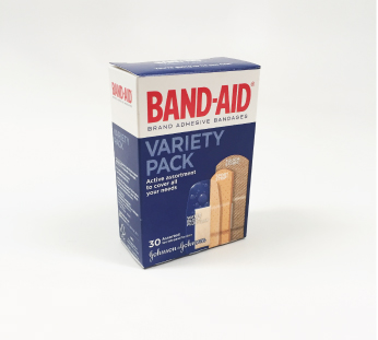
This Band-Aid package is a great example of how to tell a brand story
Every element of this Band-Aid package is deliberate and communicates the Band-Aid brand story. I can tell that the brand and design team took their time and put a lot of effort into the creative. Most people will take that for granted, but if you are in this business, you can see the attention to detail. Let’s dissect it:
Front Package Panel
All the heavy lifting is being done on the front of this Band-Aid package. It must get someone to pick up the product.
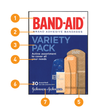
- Without a doubt, “Band-Aid” is the most important read on this box. We all know this brand.
- “Brand Adhesive Bandages” tells you what it is but I’m not sure it is necessary. However, there may be a legal reason for this logo lock-up.
- The name of the product is “Variety Pack”. I think they did a great job of calling attention to this without overpowering the design. The screen on the words provides just enough subtlety to have it fade back and standout at the same time.
- The why-to-buy statement “Active assortment to cover all your needs” is the perfect size and weight to draw the customer in to read more on the package. If they are interested they will pick up the package and look closer.
- The image does a great job of showing the differences in the type of bandages they will find in the package. They have a name for each type of bandage reversed out of the image which is successful and provides a good next level of information.
- So what is in the box? The quantity is obvious and it invites the consumer to see the side of the package for more details which makes them interact with the package.
- The endorsing brand, “Johnson and Johnson”, is also found on the front of the package which I’m unsure is necessary, but it may be a legal issue that it needs to appear with “Band-Aid”.
Back Package Panel
The back of this Band-Aid package provides more information about what is in the box.
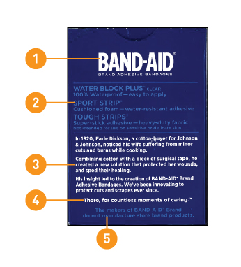
- The Band-Aid logo lock-up is repeated so no matter which side is facing the customer in-store or at home the brand is front and center.
- Product details for each type of Band-Aid isn’t the next read because it uses the screened back type. It provides just the right amount descriptive copy.
- The brand story is what I find most interesting. I don’t think anyone would take the time to read this in the store. But maybe they would? The copy is well crafted and gives the customer a sense of their pride in the product.
- The tagline “There, for countless moments of caring” gives the consumer that feeling that they really care.
- The final bit of copy makes the customer aware that there are no store brands that are manufactured by Band-Aid. You can only buy one real Band-Aid. What a great message and selling point.
Side Package Panel 1
Additional product detail can be found here.
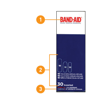
- The Band-Aid logo lock-up is repeated so no matter which side is facing the customer, in-store or at home, the brand is front and center.
- A line art illustration of each style of bandage and quantities are spelled out in detail. This is the content the customer was invited to look at on the front of the package.
- Trademark legal information is always mandatory
Side Package Panel 2
Less important information is on this panel but it is mandatory
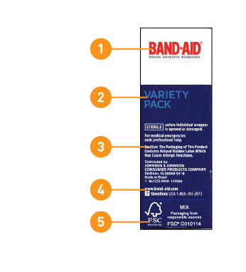
- The Band-Aid logo lock-up is repeated so no matter which side is facing the customer, in-store or at home, the brand is front and center.
- The product name “Variety Pack” is repeated.
- Legal minutia comes next.
- They aren’t afraid to have customers contact them, so that information is next.
- Finally, FSC statements
Top Package Panel
Repetitive information that supports the sale is on top of the package. A consumer may see this angle when they have it in their cart.
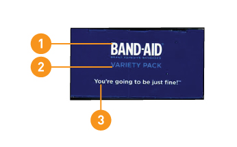
- The Band-Aid logo lock-up is repeated so no matter which side is facing the customer, in-store or at home, the brand is front and center.
- The product name “Variety Pack” is repeated.
- Another trademarked tagline is found here which gives the consumer a gentle hug from the brand: “You’re going to be just fine!”
Bottom Package Panel
Usually, the bottom of a package is relegated to just the UPC code but not Band-Aid. Every inch of this box, tells you this brand cares about you.
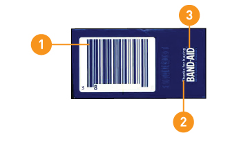
- The UPC code is prominent and easy to scan.
- Finally, a thank you from the brand: “Thanks for buying Band-Aid”
- The Band-Aid logo lock-up is repeated so no matter which side is facing the customer, in-store or at home, the brand is front and center.
If you want some more great articles about packaging design and implementation, check these out:

Leave a Reply