Even though Costco doesn’t carry that many SKUs (only 4,000 compared to Walmart’s 150,000), the size of the warehouse space and the variety of product can be overwhelming. During any trip I make to Costco, I always take a look at some of the Costco packaging and displays to note what grabs my attention and others that are just so-so. Since Costco is self serve, displays are the silent sales person. In addition, if there are only 2-3 brands in a category the packaging and display must work harder to capture the consumer’s attention and sell the product.
The Good Costco Packaging
iHome: I was immediately drawn to this iHome Costco packaging and display:
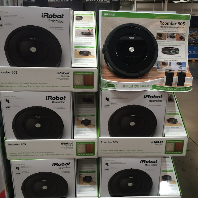
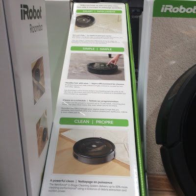
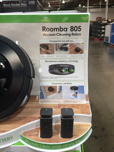
Costco Packaging for iRobot Roomba: Below is another display and packaging I thought provided great content allowing customers to make a buying decision while in store.
The Bad
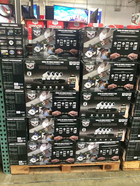
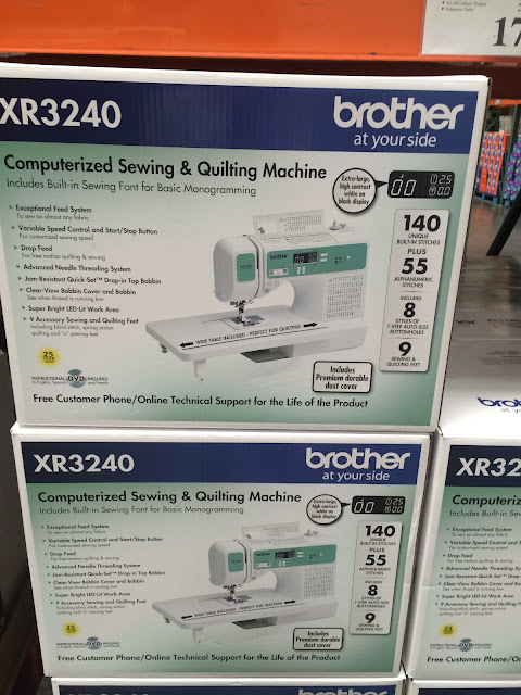
More examples below are Costco packaging designs. Granted, not every manufacturer can afford the types of displays listed above. This means that the packaging has to work extra hard to present the product. In the following cases, the packaging designs are so cluttered that it is hard to find the benefits of the product.
The Meh
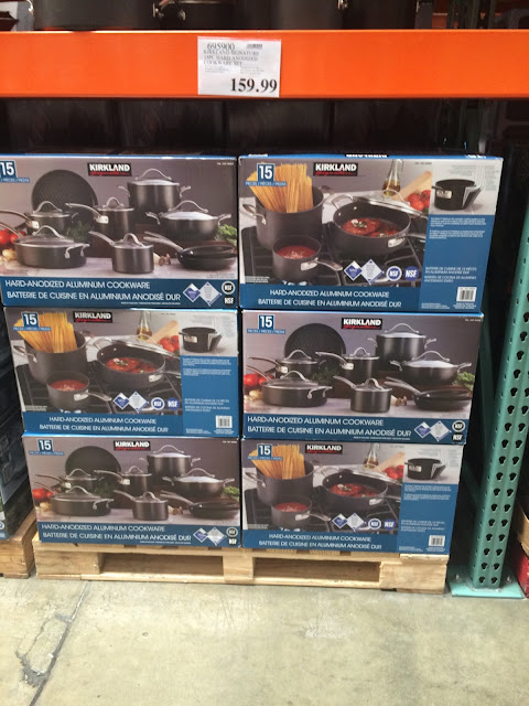
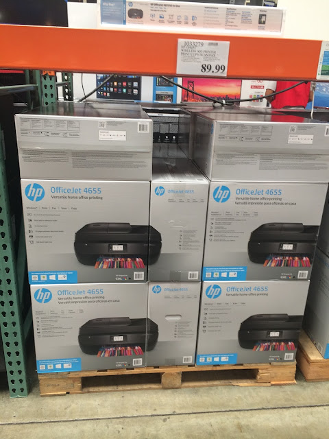
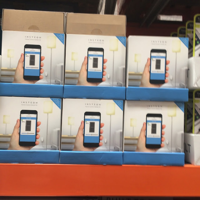
This Costco packaging and displays missed opportunities to really showcase the product and give the consumer more information to make a buying decision.
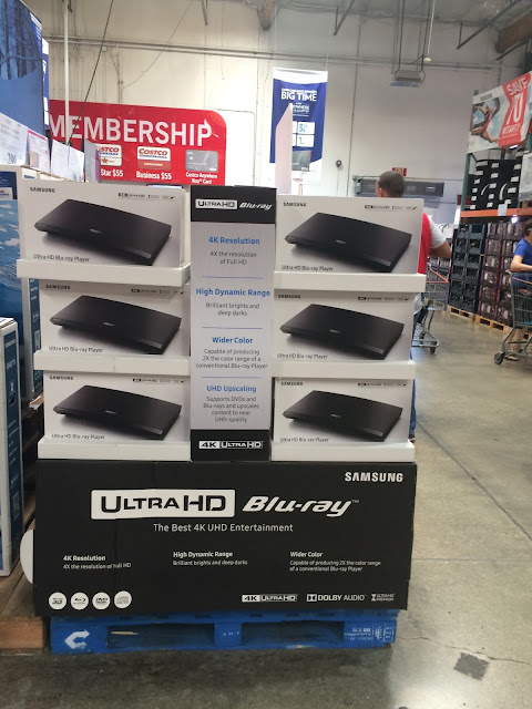
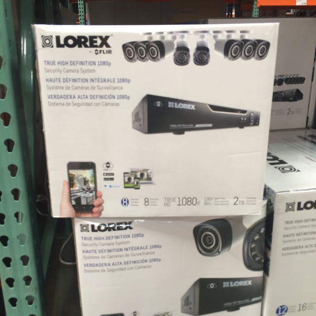
Because of the business I’m in, even a quick trip to the store ends up being a critique of sorts. These examples really drive home how important packaging and displays are to selling more product—especially in a club store environment.
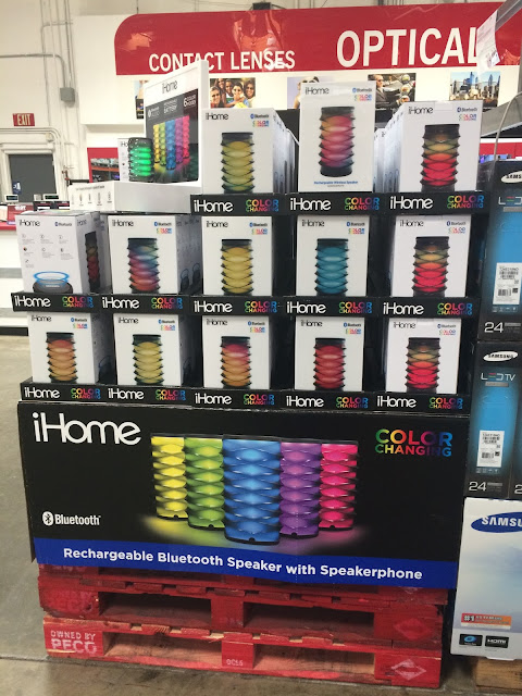
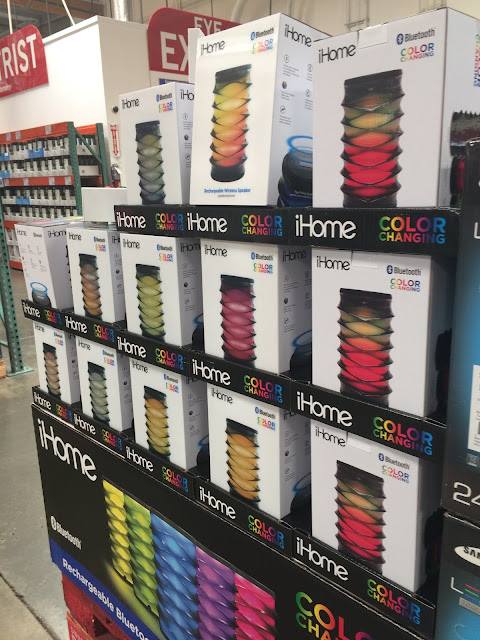
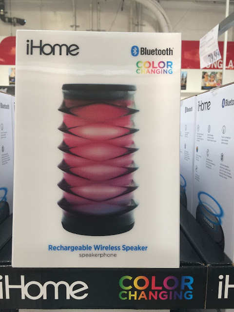
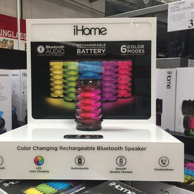

That iHome pallet wrap is awesome! For sure one of the coolest displays I have seen in a while.