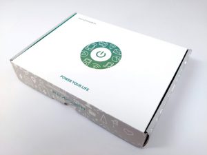
In our never-ending quest to extend the lives of our portable gadgets, we came across this little gem RavPower. While the product itself is rather unremarkable, being a simple powerbank, it is clear that the manufacturer has put some thought into the design of the packaging to set themselves apart in the sea of similar products.


Packaging Design
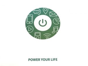
The clean and elegant simple packaging only says “POWER YOUR LIFE” and the center graphic drives the point home. It shows the power button, accompanied by pictograms representing a mobile lifestyle. It covers everything from gaming, to videos, maps, and messaging. This is a clever way to show when you need to live the mobile lifestyle to the fullest, you will need all the power you can get. This product delivers that for you. Playful graphics on the sides of the package further develops this concept.

Out-of-Box Experience
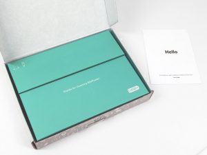
Upon opening the packaging, you will be greeted with a simple “Hello” printed on a small multi-lingual booklet. In addition, you will find two separate boxes holding the cables and the power bank itself. Where most manufacturers would have just tossed the products together in the box. Here the cables are neatly packaged in their own separate inner boxes. The two color scheme also carries nicely over from the outside.

Use of QR Codes
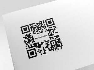
On the back of the packaging there is a QR code leading to the company’s mobile-friendly website. Unlike generic ones, this one nicely incorporates the company’s brand name in the center.
All in all, we feel the combination of small touches from the two color design, to the clever use of pictograms, and the simple and clear on-point messaging culminates in an elegant presentation of a generic product and sets it apart from competitors. A great example of how graphic design is used effectively on packaging to further the value proposition of a product and enhance the on-shelf appeal of a product.
This BLOG was written by Mehrdad Haghighi, a designer at JDA, Inc.

who did they use for the box?