This blog explores three different case studies where a package design hurts a brand.
1. Too Drastic of a Package Redesign
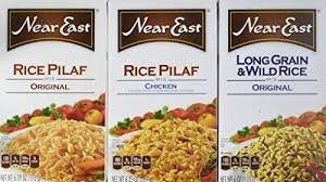
This is a brand I am very familiar with and I have purchased for several years.The name of the product was prominent and the image did a pretty well of differentiating the types of product (Rice Pilaf, Rice, Couscous) This is what I was accustomed to seeing on the shelf:
Original Design
Redesigned Packaging
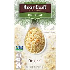


It is a great idea to use color to differentiate the product categories but as a shopper making quick decisions this doesn’t work. I purchased the original Rice Pilaf in the new packaging design on one occasion which then I associated the color green with Original Rice Pilaf. On my next trip to the store, I looked for the green package while rushing through the store thinking that would be the original flavor. What I picked up was Garlic Herb.
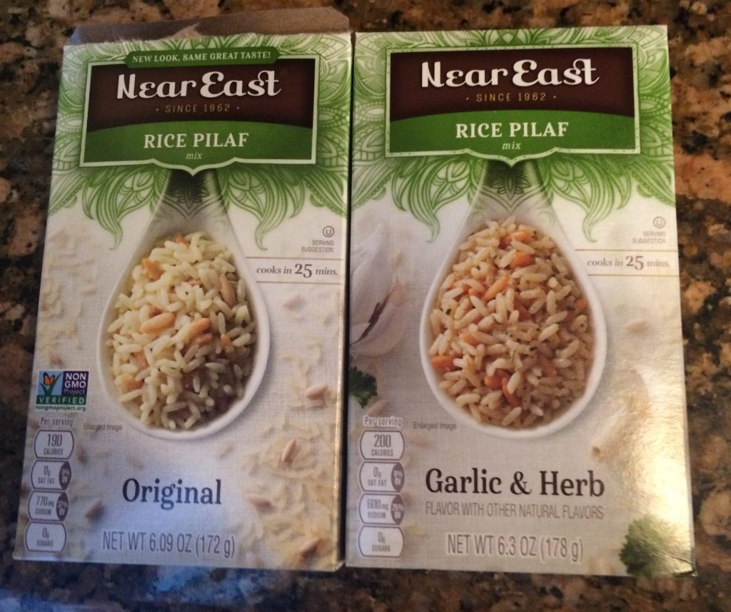
If you see these two products next to each other and your eye doesn’t go to the bottom of the package to read the flavor you are likely to pick up the wrong product. In addition, the few props in the background don’t make them look different from each other. I came home with Garlic Herb and wasn’t too happy.
Things to consider on a package redesign:
CPG products need to communicate quickly to their customer. If you have been training your customers for years to look for your package in a particular way, perhaps keep that structure. For example, if Near East had kept the name of the product at the top of the package where their customers were used to looking, green wouldn’t be the differentiating factor when shopping. Also, they could have given more visual cues or change the background perflacfor making sure they are noticeably different
2) Using the E-commerce Package in Brick and Mortar
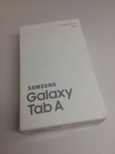
E-commerce packaging has a unique set of issues. It doesn’t need to sell the product, it must protect the product, and it might have to accommodate the product being returned. On the contrary, the package in a brick and mortar environment must help sell the product and differentiate themselves from the competition. Both packages need to be an extension of the brand and wow the consumer. Why then, would you take a package that is plain vanilla and put it in a brick and mortar store? This is an example of the Samsung Galaxy Tab A at Best Buy. It was next to competing products that were in 4-color packaging. Underwhelming to say the least.
Here are some samples of previous Galaxy Packaging that used to be available in store:
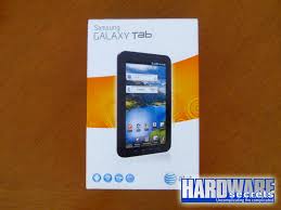

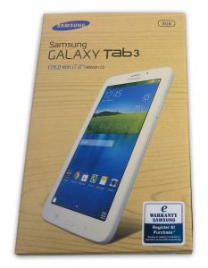
Things to consider about your package when selling in brick and mortar and on line:
Use a well designed package for both options. Granted, a 4-color package is more expensive than the plain black and white package, but it speaks volumes about the brand. This might not make the customer think it was a subpar product because it didn’t come in consumer facing packaging.
If you are looking for ideas on how to upgrade your e-commerce packaging check out this article. 14 Brilliant e-commerce Package Designs
3) Not Considering the Competition’s Package
In the private label CPG category the private label brands have had their hands slapped for being too close to the national brand. This was done purposefully in hopes someone would pick up the private label mistakenly for the national brand. What if you are in a category where it is vital to stand out against your competitor and your product blends in or doesn’t stand out?
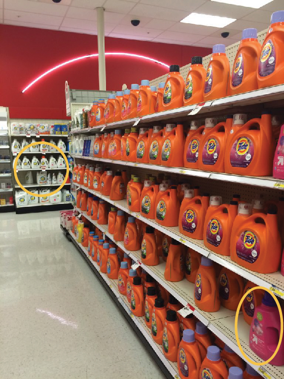
In this example of the detergent aisle, Tide owns the color orange, but look how well All stands out against the back wall. At the same time, the Target brand in pink in the lower right corner barely jumps off of the shelf.
Things to consider when developing your packaging design.
Go to the stores where your product will be sold at or want sold at and take pictures of the competition. Consider the colors that are already in your product category and how you can make it work for you.
Just like Tide owns the color orange, see what color you can stake your claim on and be consistent. If there is a feature that is a main differentiator, make this the first read on the package.

I would’ve totally made the same mistakes with those rice packages as you did–how frustrating. Great real-world examples of how packages work and not work.
I do like the redesign. It is attractive packaging but I don’t think they were thinking of the customer and how they shop for their product.